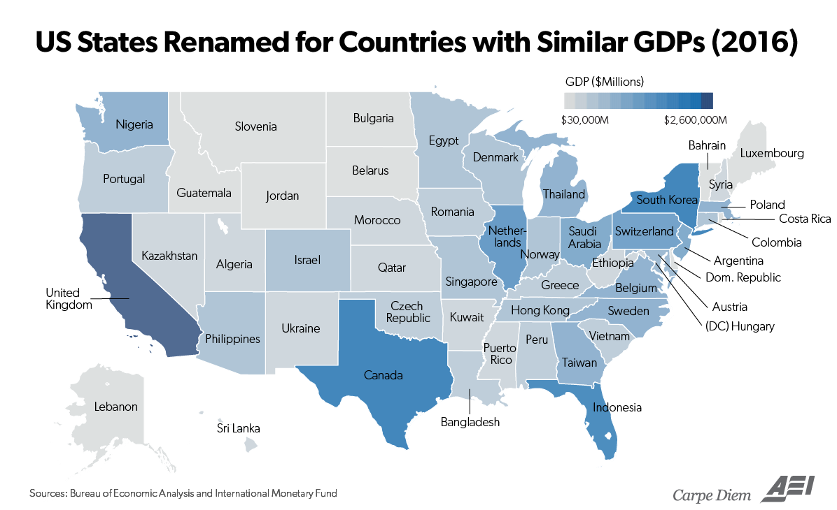
University of Michigan-Flint Economics Professor Mark Perry annually produces a very helpful visual tool: a state GDP map that compares how each U.S. state’s economy matches up to a corresponding country of equal output.
It’s a great way to see how enormous the United States’ GDP is compared to the rest of the world.
In short, U.S. GDP in 2016 was $18.6 trillion in total, which is 24.7 percent of the global gross domestic product, despite a population that is only 4.5 percent of the world’s total.
Some other interesting facts: If California, Texas, and New York were one country, it would rank third in the world, with $5.7 trillion in GDP. That would put it ahead of No. 3 Japan ($4.9 trillion) by almost $1 trillion.
Elsewhere, Pennsylvania’s GDP, $725 billion is larger than that of Saudi Arabia’s, with all its oil wealth. Florida, with a $926 billion GDP produced about the same as Indonesia, with $932 billion, even though Florida’s labor force is 8 percent of the size of Indonesia’s (127 million).
Perry explains that this feat demonstrates one of the greatest assets that America has — its people and their liberty to work.
Adjusted for the size of the workforce, there might not be any country in the world that produces as much output per worker as the U.S., thanks to the world-class productivity of the American workforce. The map above and the statistics summarized here help remind us of the enormity of the economic powerhouse we live and work in. So let’s not lose sight of how ridiculously large and powerful the U.S. economy is, and how much wealth, output and prosperity is being created every day in the largest economic engine ever in human history.
Click on the state GDP map to enlarge it.
Read the original article here.


